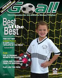
I like this design as it incorporates a very appropriate color scheme, along with a few pictures in an interesting format. The use of white and green reflects the grass and paint on a football pitch, and the solid white text also looks somewhat like the lines on the pitch. The images clearly show what the magazine is all about before you read it, which I feel would help draw a wider range of customers. Furthermore the page is not too crowded with text and images, which makes it look very sleek and professional. The one critic I would have of this design is it’s failure to include a few little snippets of information about what included in the magazine. A small bit of text such as “Find out what happened? or You’ll never guess what happened!” would help draw readers into the magazine even more.
 –
–
I like this magazine cover as it features the appropriate color scheme of green and white as well as having some snippets of information about what to expect in the magazine. This helps to keep potential readers guessing about whats inside. The title of the magazine stands out as it is in block font, however I do not like how it covers the picture. I also like the addition of the football replacing the letter ‘o’ as it suits the theme of the magazine.

I like this magazine as it has a really classic look about it. It is in the style of a 70’s or 80’s magazine which makes it look really unique. The image covering the page is a great action shot of the player which instantly shows what the magazine is about, and the title is bright and bold in order to contrast the darker area on which it has been placed.

The one critic – criticism
is there text/images missing from this blog?
LikeLike